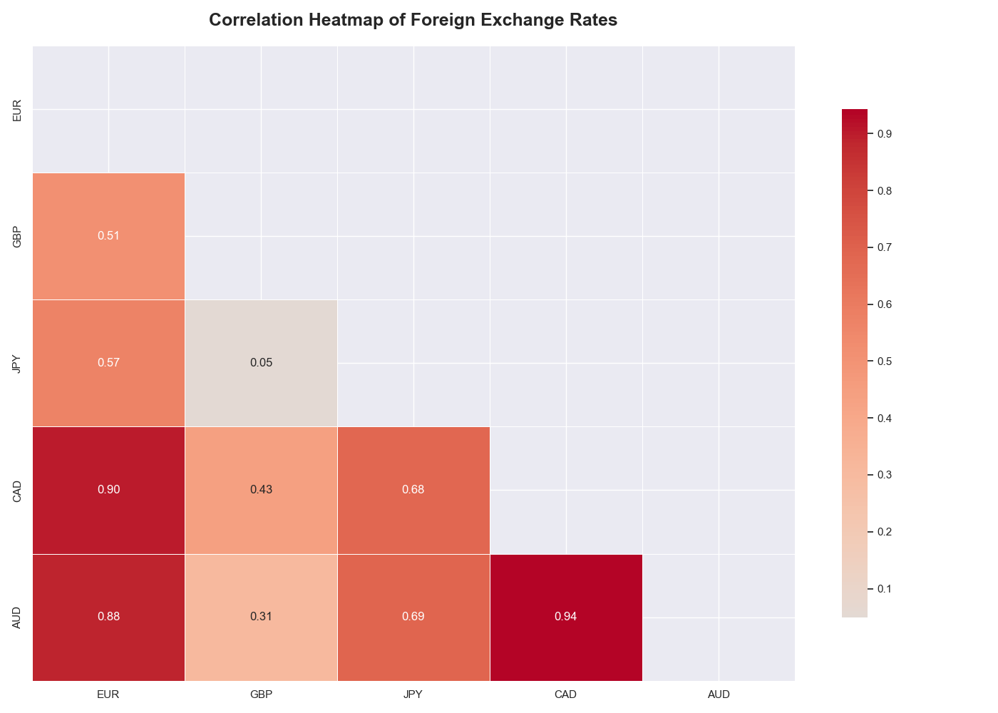
Global FX Correlation Heatmap
This heatmap illustrates the Pearson correlation coefficients ($r$) between 22 major global currencies over a 20-year period (2000–2019), with all rates priced against the U.S. Dollar (USD).
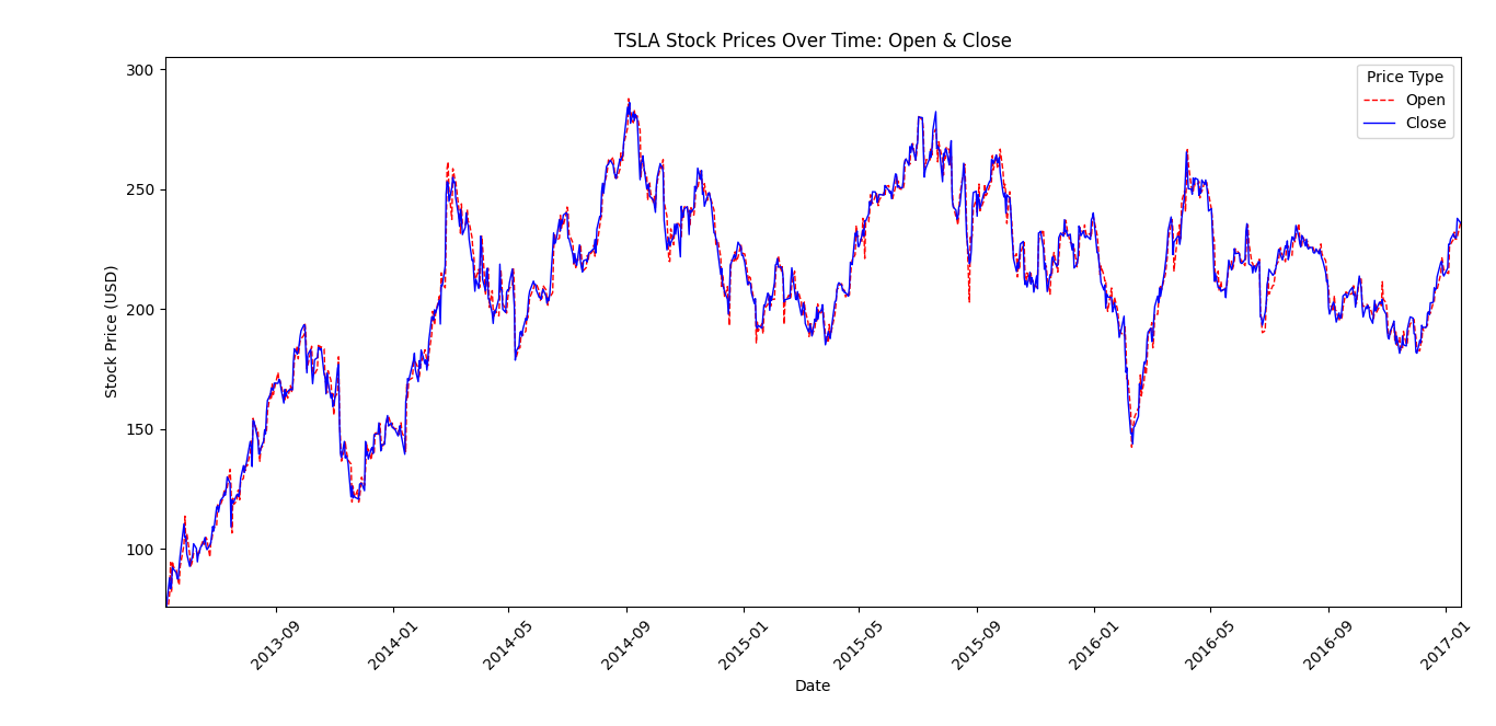
TSLA Stock Price Over Time
A time series plot shows how the stock price of Tesla, Inc. changes over time, allowing trends, fluctuations, and overall movement in the stock’s value to be observed across different time periods.
Decade of Currency Depreciation: A Study of the US Dollar vs. Brazilian Real
This dataset tracks the historical daily pricing of USD/BRL Futures (Dolfut) over a nearly 10-year period, from January 2014 to March 2023.
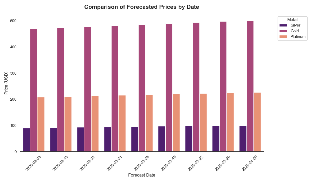
Comparison of Forecasted Prices by Date
This grouped bar chart provides a side-by-side comparison of the forecasted market prices for Gold, Platinum, and Silver over a seven-week period ending in mid-March 2026.
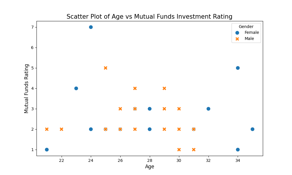
Relationship Between Age and Mutual Fund Investment Preference by Gender
This scatter plot visualizes how investment preferences for Mutual Funds vary across different age groups and genders within the dataset.
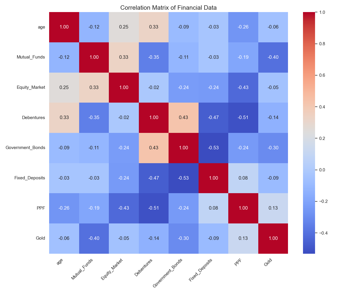
Inter-Correlation Analysis of Financial Investment Preferences and Age
This heatmap provides a comprehensive overview of the relationships between the numerical variables in the dataset, primarily focusing on age and the ratings given to various investment instruments.